We are firm believers that good interior lighting can help transform a space within the home or office. Unfortunately, the opposite is also true: Bad lighting can leave a great room feeling flat. It can render a functional space all but useless. Lighting design mistakes can change how you feel about a space entirely, whether you’re aware of it or not. Here, we’re sharing our top five lighting design mistakes to avoid, so you can make the most of your spaces.
Lighting design mistake #1: Harsh glare
Nothing makes a space feel sterile and unwelcoming quite like glaring overhead lighting does. Fluorescent interior lighting has long been associated with office spaces. Many people spend 40+ hours in the work space, but the ambiance that this type of lighting creates can be anything but inviting. Harsh lighting is unfocused. It can put significant strain on the eyes, causing headaches, squinting, and glare. Swap out the fluorescent bulbs, allow employees to opt for desk lighting they enjoy, and incorporate natural lighting wherever possible.
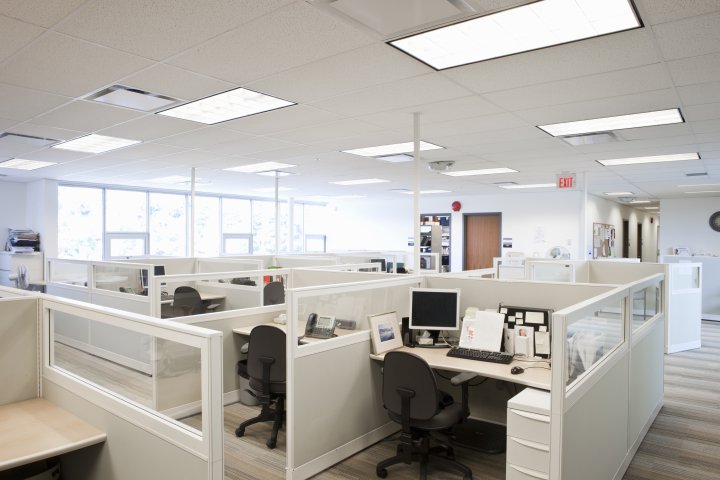
Interior Lighting Design Mistake #1: Lighting that causes strain. Photograph by Assembly – Getty Images.
Lighting design mistake #2: Dim lighting
Bright lighting is harsh, but dim lighting causes just as much strain on the eye. Struggling to see is a frustrating problem as well as a safety risk. Picture a dimly lit counter in the corner of the kitchen. Adding some under-cabinet task lighting would not only illuminate the space and make it safer to for chopping and cooking, but it would eliminate the need to strain. It would also layer the lighting in the space to help it appear more inviting overall.
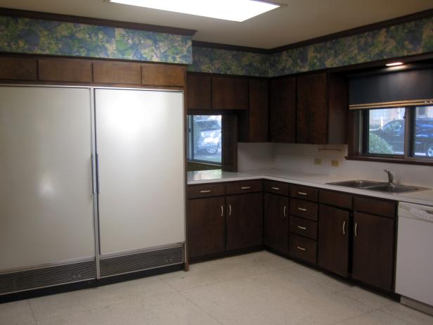
Interior Lighting Mistake #2: Not enough light
Lighting design mistake #3: Missing layers
“Layering” your interior lighting makes a positive impact on a room. The lack of layered lighting in a room may not be obvious, but rather, gives you the sense that something is missing. Mixing overhead, task, and ambient lighting is the key to creating an inviting space with depth and ambiance. Layered lighting also helps negate problems with harsh and dim lighting. It creates balance.
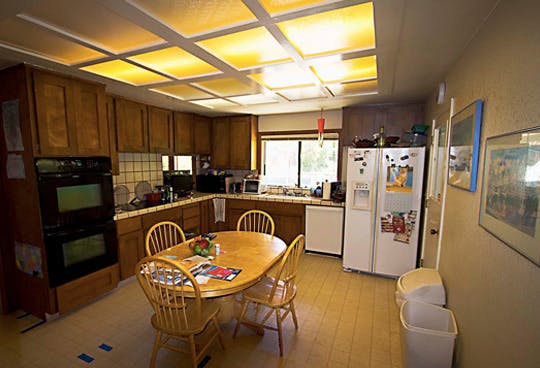
Interior Lighting Mistake #3: Not having a variety of lighting
Lighting design mistake #4: Wrong fixture for a given space
If your light fixture doesn’t match the vibe of your space, or it’s too high or low, it can look awkward or out of place. A fixture should complement the space. When picking a light fixture, consider the space that you’re choosing it for. Even if it’s a standout piece, it should blend harmoniously within the existing design.
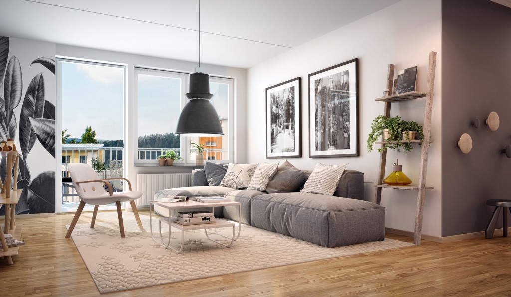
Interior Lighting Mistake #4: The light fixture doesn’t suit the space. Photograph by Certified Lighting.
Lighting design mistake #5: Lack of accent lighting
Why wouldn’t you want to showcase the most attractive elements in a space? Accent lighting is the way to do it. Whether it’s a beautiful painting or a hutch full of heirloom china, be sure to let accent lighting help draw the eye to it and create that wow factor.
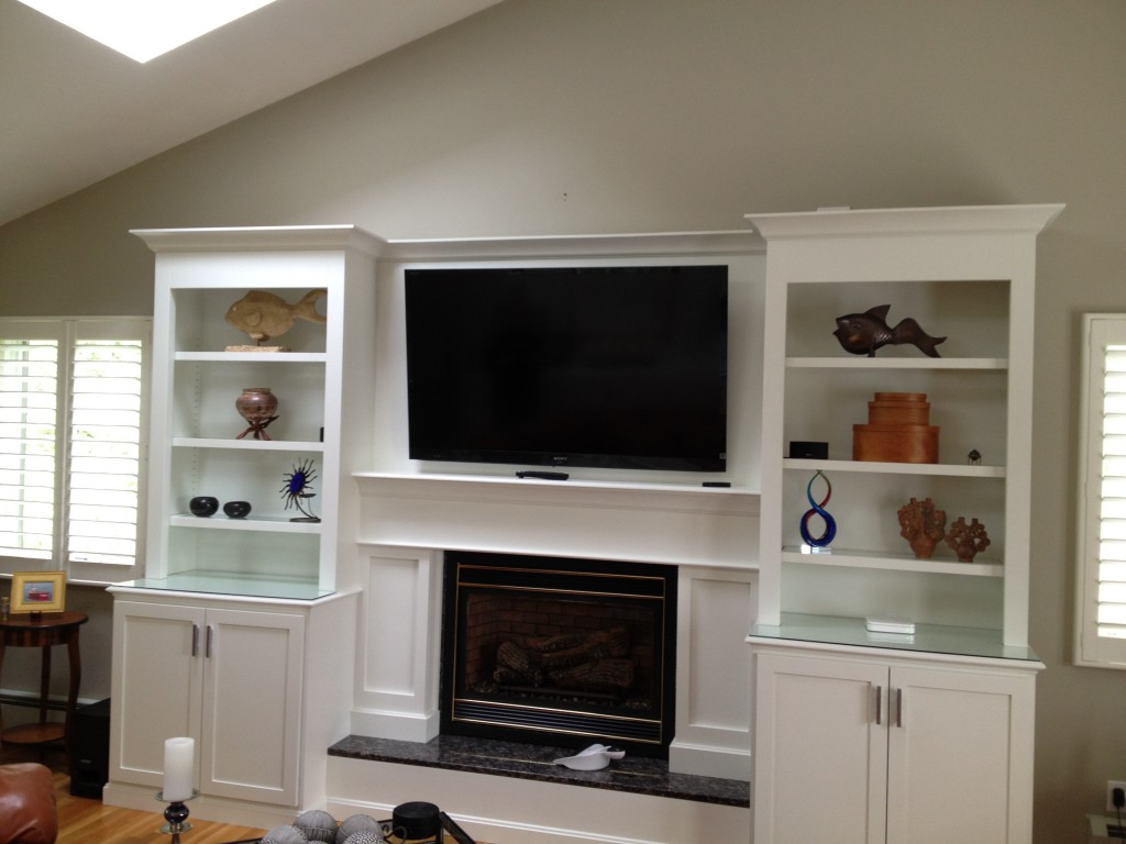
Interior Lighting Mistake #5: Ignoring the details.
Have you ever found yourself avoiding a certain room in your home or office? Lighting could be to blame. A licensed electrician can help correct the lighting design mistakes and create a welcoming vibe in any space.


